what3words
Creative overhaul of the B2C Newsletter
what3words (w3w) is a geolocation app with the mission of becoming a global standard in addressing. Every 3 metre square has been given a unique combination of three random words: a what3words address.
In September of 2023, I lead the creative overhaul of the B2C newsletter. A monthly newsletter with a subscriber base of 6+ million. The goal was to increase the average engagement with the content.
I created a modular design system for the newsletter template, as well as established new image guidelines for the email content. This resulted in the average CTR for email content doubling in the following months.
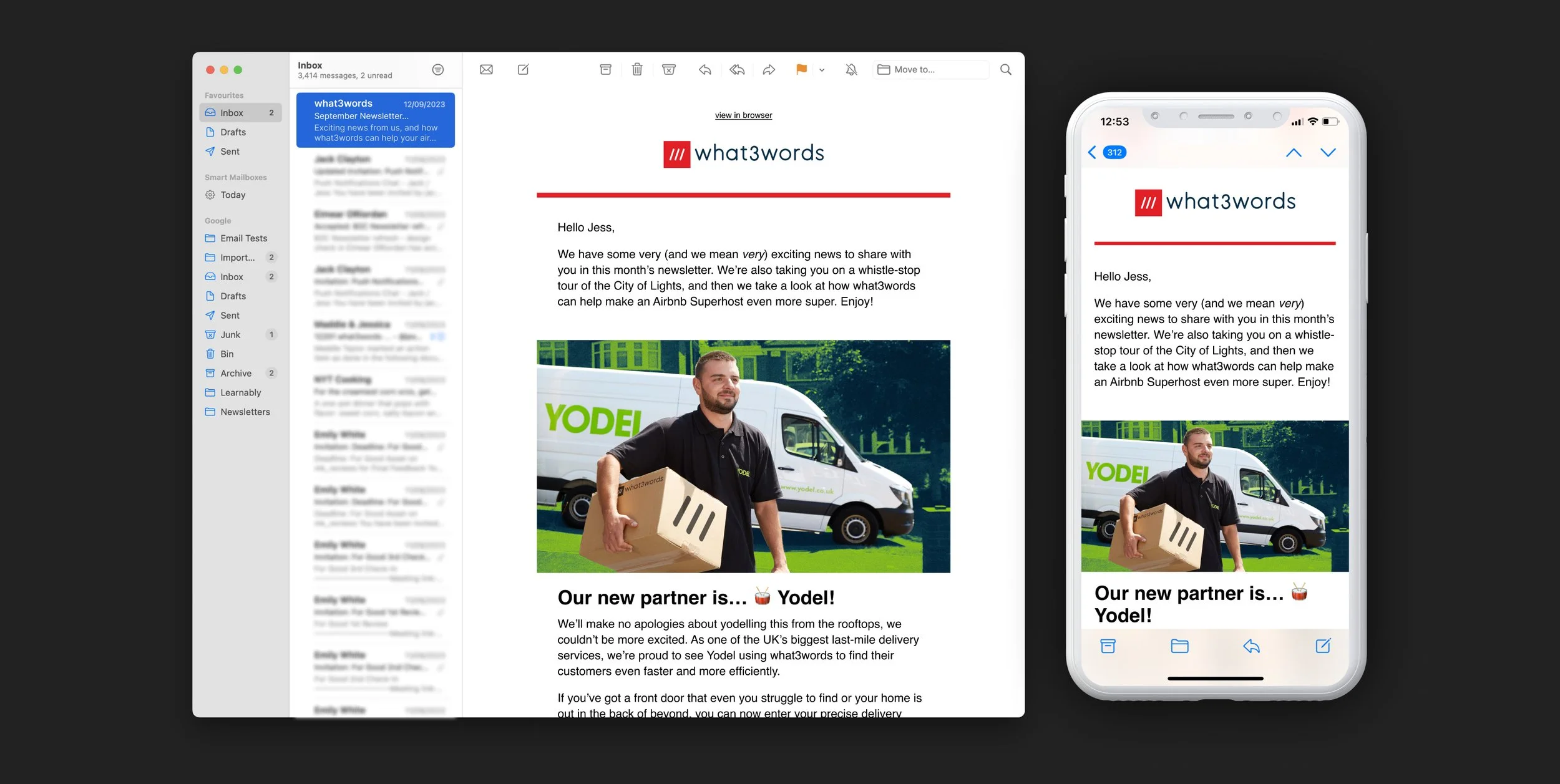
My re-design prioritised content-lead flexibility that balanced simplicity and the key recognisable brand elements of what3words and a tone of voice expressed in both the copy and the images that was both more human and more fun.
Flexible & adaptable
I completely stripped back all the design elements in the template and kept the content as the star of the show. The simplicity of the red buttons and bold red rule in the masthead makes it more flexible when it comes to creating special edition newsletters. (see below)
More human
Rather than the content having to fit the template, the template now moulds to the content! We also developed a more casual tone of voice, and injected more fun into the images. Focussing more on the human side of the stories.
More universal
The newsletter is now better equipped to exist on different devices and platforms, with the simple colour palette and web-safe fonts it can thrive in light and dark mode and stack intuitively for mobile or tablet.