what3words
Explaining what3words to a new audience using infographics
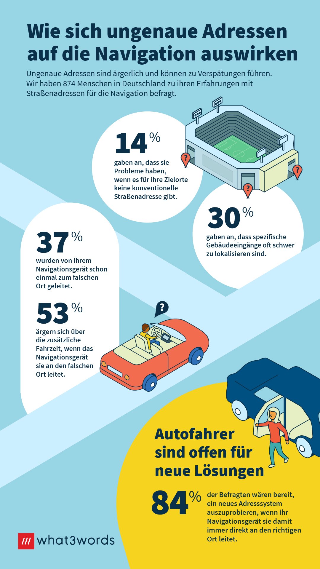
Our research suggested that to appeal to the German sensibility, using facts rather than emotion would be more efficient. So I developed a visual identity for infographics fitting within the what3words brand identity.
Inspired by illustrations developed by previous Product Design Lead Niki Forecast, I used simple circles and arches to give the idea of missed connections, isolated islands and dead ends. All things that these what3words use-cases would help you avoid. The facts and stats then fit into these alcoves to create a narrative down the page.
These were incorporated into the German Press Kit, for journalists to support their articles.